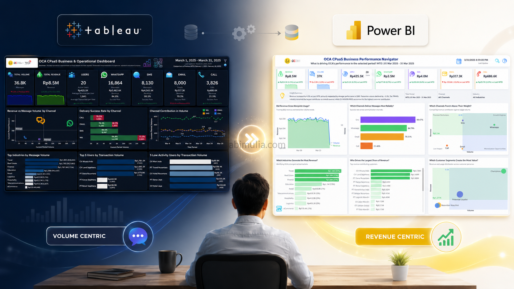
Project Highlights
Over the past few weeks, I’ve been working on a complete redesign of a Business Performance Navigator Dashboard, and I’m excited to share some of the key features I implemented to elevate the analytics experience.
This project blends data modeling, time intelligence, UX design, and automated insights into one cohesive product.
⏱️ Time Intelligence Filter (MTD, QTD, YTD, WTD, Custom)
I built a fully dynamic Time Intelligence Engine that automatically detects the selected period and adjusts all KPIs and visuals accordingly.
Whether users choose MTD, QTD, YTD, WTD, This Month, Last 3 Months, or a Custom Range, the dashboard instantly recalculates and compares performance with the correct previous period.
This makes the dashboard feel responsive and context‑aware.
💡 Insight Tooltips & Narrative Templates
Instead of cluttering the dashboard with text, I embedded smart insights directly into tooltips.
Users can hover over charts to reveal:
- Growth/decline explanations
- Channel‑level performance drivers
- Industry and customer contribution insights
- Auto‑generated narrative sentences
This keeps the UI clean while still delivering deep analytical context.
🆘 On‑Screen Help for Better UX
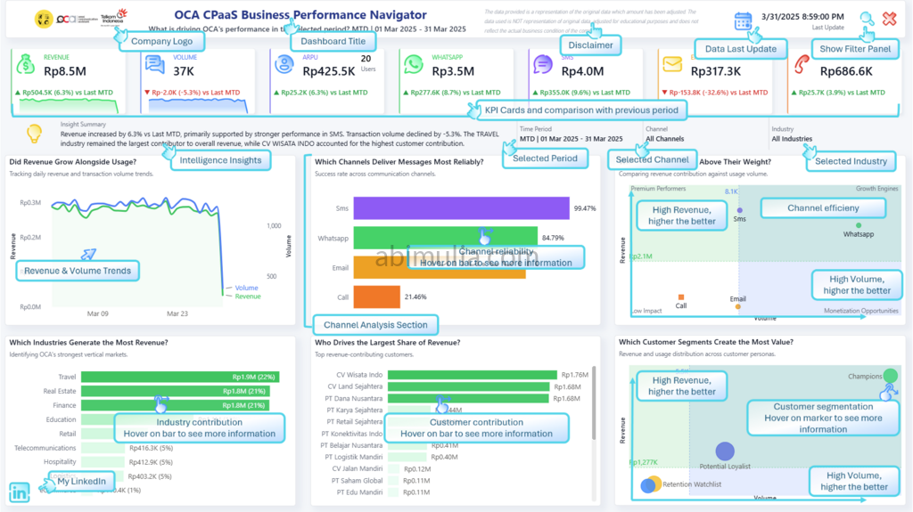
To make the dashboard more intuitive, I added an On‑Screen Help panel that explains:
- How to interpret each chart
- How comparisons are calculated
- How the Time Intelligence Filter works
- What each KPI represents
This reduces onboarding time and empowers non‑technical users to explore insights confidently.
🧹 Hidden Filter Panel for a Cleaner Layout
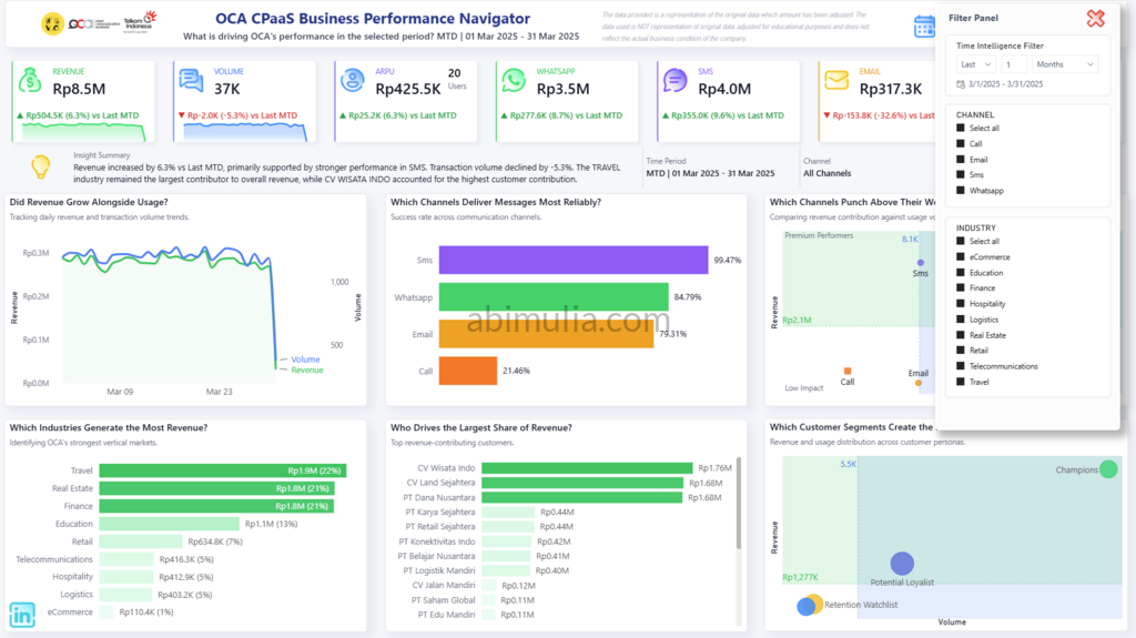
I intentionally hid the default filter panel to maximize canvas space and reduce visual noise.
All filtering is handled through custom controls and slicers, resulting in a cleaner, and made user more focused on the dashboard.
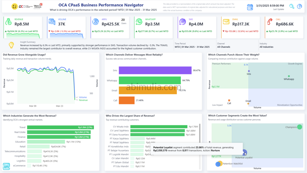
📊 Selected Period vs Previous Period Comparison
Every KPI and chart includes a dynamic comparison against the correct previous period:
- MTD vs Last MTD
- QTD vs Last QTD
- YTD vs Last YTD
- Custom Range vs Previous Period
This helps users quickly understand performance trends and identify what’s driving growth or decline.
✨ Final Thoughts
This project was a great opportunity to combine:
- Data modeling
- Time intelligence logic
- UX/UI design
- Automated insights
- Data storytelling
I’m excited to continue refining this dashboard and exploring more ways to bring clarity and intelligence into business reporting.
Live Power BI Dashboard